

Visual Weight: Design
Digital to Sawdust — Design Studio:
Woodworking design and furniture geometry — the digital tools and visual decisions that shape refined work.
Seeing Balance Before You Build
Most woodworking mistakes don’t come from bad cuts or weak joints — they come from design. From proportions that feel off, from tops that look too heavy, from legs that look too thin, from pieces that don’t match the picture we had in our heads. We’ve all built something that was engineered perfectly but still looked wrong, and we usually blame ourselves without ever understanding why.
This story exists to fix that.
Estimated read time 8-9 minutes
BY THE END OF THIS STORY
I’m not teaching you how to build a table. I’m teaching you how to see one — how to understand visual weight, balance, proportion, and the simple 60/40 map that guides every good design. Because once you learn to see these things, every project you build starts to make sense. You stop guessing. You stop wasting wood. You stop fighting your own ideas.
Design isn’t magic. It’s a skill. And this is the shortcut I wish someone had given me years ago.
What You’ll Learn
how to see visual weight
how the 60/40 split guides balance
how taper, radius, and edge profiles change heaviness
how to map a pedestal before you build
Digital to Sawdust — Design Studio
Woodworking design, furniture geometry, digital layout, and step-by-step lessons for building refined work.
Want to study the proportions yourself? Grab the drawing I used in this story — it’s free. Print it and follow along while you read — the proportions make more sense when you see them.
When a Table Looks Wrong
Have you ever seen a table with a thick top and thin legs and thought, “That looks wrong”? The kind of table where the legs don’t look like they were designed to carry anything more than a lamp on a side table — yet there it is, out in the world for everyone to see.
And worse, maybe it’s something you built.
Woodworkers Aren’t “Designers” — But We Design
Most of us don’t think of ourselves as designers. We’re woodworkers. We cut, we build, and most of the time we follow plans from magazines or downloads. I’ve made every mistake out there, and that’s how we learn and get good at woodworking. Engineering a solid joint or turning something clean on the lathe is skill enough — and we can master that.
The Pedestal Problem
But matching a turned pedestal to a tabletop is surprisingly difficult. The piece of art in our head doesn’t always match what ends up on the bench. We see ideas clearly in our minds, but laying that idea out in wood can be frustrating. Practice makes perfect, sure — but how much practice? Wood is expensive, and nobody wants to waste shop time.
So let’s talk about it. Let’s work through the issues, because I’ve faced them many times and slowly figured out how balance and visual weight affect every design decision.
Drawing to See Clearly
When I started writing this, I found I needed to draw something up to get my head in the right space. I drew a dining room table. Sounds simple, yet it took an hour and a half in AutoCAD before the table looked and felt right — and even then, I’m still not sure the design is right.
Designers Start in the Room — Woodworkers Start in the Shop
If a designer is thinking about a table, they start with the environment. They see the room, the wall colour, the cabinetry, the lighting, the flooring, the windows, the texture, and the chairs around it. That’s their world, and it matters. A table has to fit the space it lives in.
But this story is written from a woodworker’s perspective. Because I’m a woodworker. And when I design a piece, my mind doesn’t start in the room — it starts in the shop. I’m already building the table in my head with the tools I have, the wood I trust, and the problems I know I’ll face.
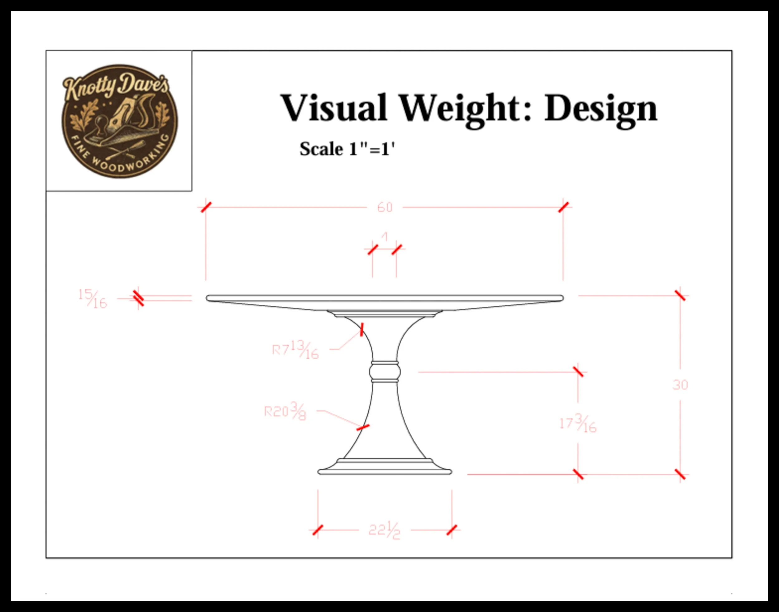
In the drawing shown, I picked a 2½‑inch thick tabletop at 60 inches round for no reason other than it felt right. Then I added a single turned pedestal. And it looked horrible. So I started shaving off weight — not physical weight, but the visual weight that makes a table look heavy.
The 60/40 Split: A Builder’s Ratio
I’ll keep this simple. Don’t click away. I know this can get deep, but we’re staying in the shallow end. I start with the 60/40 split — the builder’s version of the Golden Ratio. The exact number is ϕ ≈ 1.618033988749894… but for shaping a rough design that gets changed over and over, 60/40 is close enough. I wrote a story about this ratio; you can read it HERE - Woodworking Design: Getting It Right
Mapping the Pedestal
I started with the pedestal, and to prevent a spontaneous math class from lighting up, I stuck to the 60/40 split. First decision: how wide should the pedestal be? I used the 60/40 idea. As a simple proportion, I wanted the base to be about 40% of the tabletop’s diameter. A 60‑inch top gives me a 24‑inch base. Easy.
Next, I needed a balanced middle — the centre of that turned hourglass shape. I used the 60/40 split again and marked a horizontal line. Now I knew the visual centre. That’s the map. Every line I drew after this used that map until the tweaking and nudging finally felt balanced. Design is more than engineering — there’s feeling involved. As humans, we’re visual creatures. Shaving lines is addressing beauty; the 60/40 split addresses the engineering with a ratio that inspires design.
The Lines You Don’t See
When you look at the finished drawing, you’re only seeing the lines that survived. You’re not seeing the dozens of lines I drew, erased, redrew, nudged, and abandoned along the way. That’s design. Most of it never makes it to the final sheet.
Fresh Eyes Change Everything
And here’s the truth: fresh eyes change everything. I’ll draw a pedestal, think it’s close, walk away, come back 24 hours later, and instantly see what works and what doesn’t. Sometimes all it takes is a gentle nudge of a curve or shifting a line by a quarter inch. That tiny adjustment can completely change the visual weight and make the whole piece feel balanced.
Design isn’t a straight line. It’s a slow shaving process — removing what feels wrong until what’s left finally feels right.
Fixing the Top
Next, I looked at the top. It was way too heavy. But I still wanted a physically hefty table — something with presence — and I’m not interested in designing a copy of something you could buy at Ikea. So to visually lighten the table while keeping the mass, I gave the top a long taper and a bullnose edge profile.
That does three things. First, it leaves a soft, comfortable edge for resting your arms, and it’s easy to wipe clean. Second, and more important for design, the taper removes the bulk from the edge. The table still has its physical heft, but the eye reads it as lighter. That single decision changes the entire visual weight of the piece. And third, the bulk of the weight gets centred over the pedestal, which keeps the table extremely stable. All that mass is right where it needs to be.
The Final Tweaks
At this point, when the top is shaped and the pedestal is roughed in, the final tweaks can be made to either part. And this part is entirely feel. You know what’s right. I can’t write that feeling or show it. When you know, you know.
Paper vs Real Life
Now we have a table design — something balanced, something you can be proud of, or something that still isn’t quite finding its form. And here’s a secret that professional designers and cabinetmakers don’t talk about much: every drawing you make is a 2D image meant for a 3D world. In real life, perspective hides things. The pedestal gets buried behind chairs, lost in shadow, and visually compressed by the room around it.
So sometimes a design looks perfect on paper, but in real life it needs to function more than it needs to look good. And sometimes the thing you designed just doesn’t work out the way you hoped. I’m telling you right now — design is difficult, and sometimes we fall short. It’s okay. Like I said, practice makes perfect, and we get better as woodworkers.
Design Meets Reality
We all know what happens to pedestals in real life. They get kicked by feet and shoes, bumped by brooms and mops, slept against by dogs, prowled over by cats, and slowly corroded by cleaning chemicals. Kids are tough on furniture, accidents happen, scratches appear. But as woodworkers, we design and choose materials that can survive their environment. It’s all part of the plan and part of life.
The Real Work of Design
Getting the design right — or choosing a design we can actually build — is part of the fun. Sometimes we download a plan, sometimes we see something in a book, sometimes we adjust an existing design because we see a better way. That’s woodworking. And this drawing I made? I think it looks alright. It’s balanced, and it would make an incredible table.
But here’s something I’ve learned after working with clients, designers, and other cabinetmakers: design is subjective. Rarely is a design I pitch ever right the first time. I’m almost always back at the drawing board, this time with the customer’s input layered over my own. That’s normal. That’s the process.
Design Is a Journey
Design is a journey, not a formula. The 60/40 split is just a map — a place to start when the blank page feels too big. The rest is feel, practice, and the willingness to erase a line and try again. Whether you’re building a table, a chest of drawers, a jewellery box, or a dog house, balance comes from the same place: your eye, your experience, and your patience. We get better as woodworkers. Every project teaches us something. And that’s the real story behind this table — not the table itself, but the way we learn to see.
Balance Over Size
Size doesn’t make a design right or wrong — balance does, and once you find it, everything falls into place.
In short
Balance isn’t a measurement — it’s a feeling shaped by proportion, taper, radius, and shadow. The 60/40 map gives you a place to start, and your eye does the rest. Once you learn to see visual weight, every project becomes easier.
Visual Weight: Pedestal Table Design
A balanced pedestal table begins long before the first cut — it starts with proportion. This drawing shows how the 60/40 split guides the relationship between the top, the pedestal, and the base, creating a design that feels stable, intentional, and visually light even when the materials are heavy. Every curve and radius in this sketch reflects the quiet adjustments that make a table look “right,” proving how small shifts in shape can completely change the visual weight of a piece.
Digital to Sawdust — Design Studio
Digital tools, layout, and proportion — the design side of woodworking before the sawdust begins.
SHARE
Digital to Sawdust — Design Studio
Lessons in woodworking design, geometry, and digital layout — teaching how furniture is shaped with intention.— head to the Design Studio. Just one click away.
If you’d like to hear from me only when something big is happening — a launch, a milestone, or a major project — you can join the mailing list below.
Written by David Flather, Red Seal cabinetmaker and founder of Knotty Dave’s Fine Woodworking — a Manitoba shop rooted in heritage restoration, storytelling, and real craft.
All photos shot by David Flather — in the shop, on the road, and in the places where craft and story meet.
Related stories:
Return to: Shop Rambles
