

The Quiet Geometry of Furniture
Quick Answer: How does geometry shape furniture and room mood?
Rectangles create rhythm and stability, curves soften emotional tone, columns add structure, and door styles shift mood — all shaping how a room feels long before colour or materials enter the design. Geometry controls the emotional tone of a space, giving woodworkers a quiet map for creating furniture and cabinetry that feel intentional instead of accidental.
What You’ll Learn
how rectangles create rhythm and stability
how curves soften a room’s emotional tone
how door styles change mood
how geometry shapes cabinetry and furniture
how to see emotional flow in a room
A woodworker’s guide to shapes, rhythm, cabinetry, and the emotion of design
Why some rooms feel right the moment you walk in — and how geometry quietly controls every bit of that emotion.
BY THE END OF THIS STORY
You’ll understand how geometry shapes furniture, cabinetry, and the quiet mood of a room — and how simple shapes create emotional flow in any space.
Estimated read time: 7 minutes
Comparison — Rectangles vs Curves in Furniture Geometry
Rectangles — structure, rhythm, stability
Curves — comfort, softness, emotional tone
Columns — vertical stability, visual grounding
Door styles — mood, layering, rhythm
Shape language — emotional flow
Quick summary
Geometry shapes the mood of a room long before colour, hardware, or materials enter the design. Rectangles create rhythm and stability, curves soften emotional tone, columns add structure, and door styles shift how a space feels. Once you learn to see these shapes — the quiet language behind cabinetry, furniture, and room flow — your designs start feeling intentional instead of accidental.
Want to study the proportions yourself? Grab the drawing I made for this story — it’s free. Follow along while you read — the proportions make more sense when you see them.
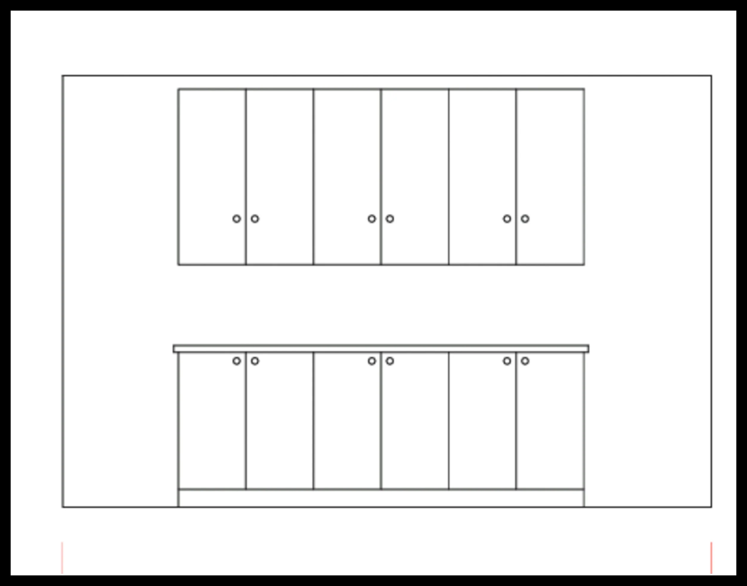
Average Office Cabinets — Shape and Mood Study
This simple cabinet sketch shows how everyday office layouts rely on predictable geometry. Six doors above, six doors below — a standard rhythm that feels familiar because it’s everywhere. The drawing isn’t about style; it’s about weight. When cabinets stack evenly, the room feels stable. When the proportions shift, the mood shifts with them. This is the baseline most people never notice, but it’s the foundation every design decision builds on.
Why Design Matters More Than Tools
When we as woodworkers are in the shop, it’s easy to cut a straight line, then another and another. But curves and circles — that gets complicated. There’s bandsaw work, router work, bent laminations, steam bending, and if you’re lucky enough to have a CNC, some of this work gets simplified once you understand the machine. But when you strip all of that down, it lands on design. It doesn’t matter how good you are with the tools; it’s the design that creates flow and mood. And if you don’t understand the design, your builds will always follow someone else’s plan. If you want to create a custom design of your own, I’ll walk you down the path to seeing shapes in design — and more than just seeing them, understanding the language that appears when geometry is balanced.
Common Mistakes
Relying on tools instead of design
Ignoring room geometry
Using rectangles without rhythm
Choosing door styles without mood
Adding curves randomly
Overcomplicating shapes
The Room: Your First Rectangle
Squares and rectangles are the backbone of design, especially in a room. Design isn’t just one piece of furniture — it’s the room itself. And the first square or rectangle is the room: the floor, the shape, the height, the windows, the doors. That’s the beginning of every design. These elements exist in every space. They have to. So these shapes form the bare bones of design in any room. They dictate traffic patterns, and the light from the windows creates softness and shadows that shift throughout the day. The rest is up to us as homeowners, designers, and woodworkers. We can add cabinets, an island, a table — and most of these pieces will be rectangles. Our built world is filled with boxes. They create order, stability, strength, and flow. But how a bunch of boxes screwed to a wall looks can completely change the mood.
Boxes, Standards, and the Mood of a Room
There are places where the industry follows standards — not code, but functional norms. A 36‑inch countertop height, 18 inches between uppers and lowers, a 30‑inch dining table height. They’re the easy part of design. What’s harder is everything that happens beyond those standards. I’ve seen kitchens built from white boxes bought at a big box store, screwed to the wall, countertop dropped on top — fast, cheap, and perfectly functional. I’ve also seen the opposite: gloss‑painted panels, brass rails, cabinetry running floor to ceiling with lighting placed exactly where it needs to be. That’s design built for emotional payoff. Most rooms live somewhere between these two extremes. And emotion doesn’t require a high budget — it requires shape.
Columns, Rhythm, and Visual Stability
Imagine a basic kitchen: an upper box and a lower box hanging on a wall. How do you get emotion from that? You add more shapes. Add a column from floor to crown and you create visual stability. The column might only be two inches thick, but its form adds power — it transfers the visual weight of the uppers straight to the floor. Suddenly it’s not just boxes screwed to a wall. It’s a structure. Add a few more cabinets, add columns between them, and everything becomes a unit instead of a collection of rectangles.
Door Styles and the Emotion of Geometry
I have two drawings for this story. The first is built for function — the basic lunchroom cabinet wall. It’s boring, cheap, and it works. The second drawing uses the exact same footprint, but the mood changes completely. I added four columns: the two on the ends rise all the way to the crown, and the crown meets the ceiling. The other two columns are shorter and stop at the countertop. Those columns pull the uppers and lowers into a single unit, a system. They add flow and stability. Look closely and you’ll see a light valance running beneath the uppers; like the crown and countertop, it stretches across the wall and creates rhythm. The basic cabinets are still just boxes screwed to the wall, but the added shapes are the rhythm that gives the wall its mood.
I drew four door styles to show how geometry changes emotion. The lunchroom version uses slab doors — purely functional. The next version uses half‑moon panels, which double as pulls with a small hollowed‑out crescent. That curve adds a casual softness to the rhythm. The second set uses standard shaker doors, simple but structured, with just enough layering to feel intentional. The third uses an applied raised panel; that extra rectangle adds depth and pushes vertical flow far more than the other two. Each door style has its own emotion, and each feels different despite sharing the same footprint and the same underlying cabinet system.
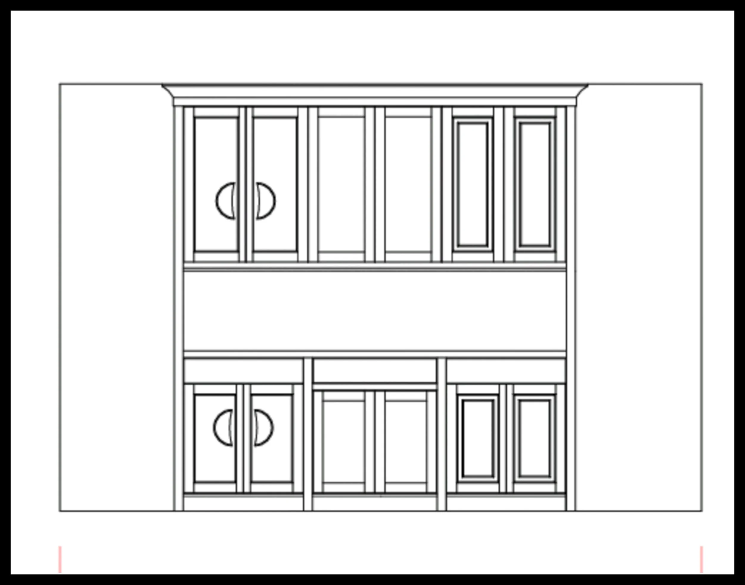
Twelve‑Door Built‑In With Three‑Drawer Center — Shape and Mood Study
This cabinet drawing is all about the mood created by repeating shapes. Six upper doors, six lower doors, and a trio of drawers form a quiet rhythm — a steady pulse across the wall. The rectangular doors create a calm, orderly feeling, while the centered drawers add a gentle pause in the middle of the composition. The crown molding softens the top edge, giving the piece a sense of presence without feeling heavy. It’s a study in how simple shapes, repeated with intention, can make a room feel settled and confident.
Why Finished Rooms Feel Alive
When you walk into a finished room — cabinets installed, table in place, windows trimmed, doors hung — you can feel something even if you can’t explain it. You just know the room feels good. That feeling is the language of the design. An empty room doesn’t have it. But once the shapes, proportions, and rhythms are in place, the design starts speaking quietly. If you feel something, even if you don’t know why, the design is working. It’s alive. It’s expressing emotion through geometry.
Curves: The Quiet Language of Comfort
Next time you’re in a nice restaurant, look around. It’s just another room — a square box with banquettes, tables, windows, and doors — but it feels different. Restaurants want you at ease, so if you pay attention, you’ll see circles and curves everywhere. Round tables, curved banquettes, soft corners. Those shapes create a relaxing, calming emotion before you even taste the food. If you’re already at ease when you sit down, the food simply tastes better — and there’s a good chance you’ll spend more.
I noticed the same thing at my lawyer’s office and my dentist’s office. Both places carry a natural anxiety, yet both were designed with curved walls, rounded tables, and reception desks with soft arcs. The designer wasn’t decorating — they were shaping emotion. Even at CancerCare, where fear sits quietly in the room, the architecture uses circles and curves. It’s calm there. And it should be.
Applying Geometry to Your Own Designs
So how do you apply this to design? Any room is full of rectangles with more rectangles layered on top. Add some curves, some circles. Based on my drawing, it can be simple. Instead of a rectangular table, add a curve to the long edge — that simple act softens a room. Think of a table with sharp 90° profiles, then compare it to a big quarter‑round edge. Both are functional, but one speaks comfort. A round table changes the flow of a room, or the corner where the table sits. The traffic pattern moves smoother around a round table. The room feels calmer.
Keep It Simple: Kindergarten Shapes
When it comes to design — the basic geometric patterns, the layers, the flow — it’s simple shapes. These shapes live together, and if arranged well, you’ll feel it. And I want you to understand this clearly: keep it simple, keep it clean. It doesn’t take much. We’re after a quiet feeling. The geometric shapes you learned in kindergarten are the same shapes we use in furniture and architecture. Don’t overthink it. That’s my biggest struggle too — aiming too high when the design really just needs simplicity.
Seeing Shapes in the World
If you want to make a memorable design you can actually build, look at the world and feel the world. It’s in trucks and cars, bridges and buildings. You know good design when you see it because you feel the emotion in the shapes. Just look, and notice what’s doing the talking. It’s usually something simple, right in front of you. It’s just geometric shapes. If you can see them, you’re already on your way.
Good Design Speaks Quietly
Bad design has nothing to say, or it shouts. Good design doesn’t demand attention. It speaks quietly, and you can feel it. It’s calm, and you feel calm. That’s the emotion of design — that sense that this place is nice, that you could stay here all day. That’s the power of geometry: the simplest shapes creating the deepest calm.
In short
Geometry is the quiet language of design. Rectangles create structure, curves create comfort, and rhythm creates mood. Once you learn to see these shapes, every room starts speaking clearly.
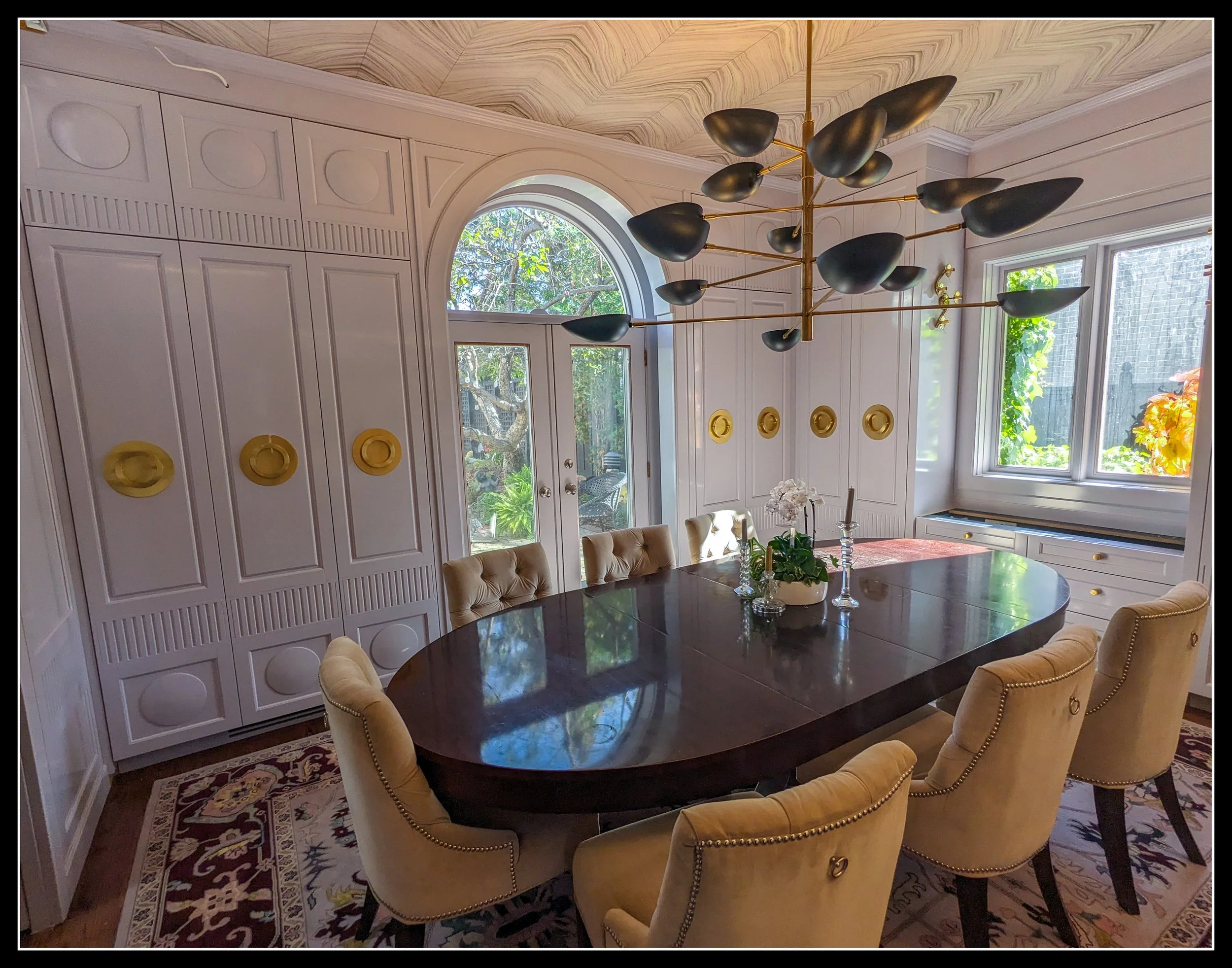
Softened Geometry — Curves Inside a Rectangular Room
This room is built on a foundation of rectangles, but its mood comes from the few curves you chose to introduce. The round brass pulls, the circular raised panels, the soft archway, and the gentle curves in the chairs all interrupt the straight lines just enough to change the emotional tone. Most of the geometry is structured and box‑shaped, yet those circles and curves warm the space and make it feel welcoming. It’s a clear example of how a small shift in shape can soften a room and create a more inviting atmosphere.
Digital to Sawdust — Design Studio
Digital tools, layout, and proportion — the design side of woodworking before the sawdust begins.
SHARE
Digital to Sawdust — Design Studio
Lessons in woodworking design, geometry, and digital layout — teaching how furniture is shaped with intention.— head to the Design Studio. Just one click away.
If you’d like to hear from me only when something big is happening — a launch, a milestone, or a major project — you can join the mailing list below.
Written by David Flather, Red Seal cabinetmaker and founder of Knotty Dave’s Fine Woodworking — a Manitoba shop rooted in heritage restoration, storytelling, and real craft.
All photos shot by David Flather — in the shop, on the road, and in the places where craft and story meet.
Related stories:
Design Geometry: How Designers Shape the Visual Weight of Furniture
Visual Weight in Woodworking: How Proportion Shapes the Feel of Furniture
Woodworking Design: Getting It Right: The 60/40 Rule for Better Design Balance
Photography For Woodworkers: Turning Shop Light Into Real Photography
The Workshop Library
If you enjoyed this story, there’s lots more like it inside The Workshop Library — and it’s free to explore.
Wood Archive — species, grain, working properties, and real‑world craft notes
Behind the Grain — the deeper stories inside wood, craft, and heritage
The Working Side of the Craft — tools, shop life, workflow, and the realities of making
Digital to Sawdust — Design Studio — geometry, proportion, visual flow, and design thinking
The Stories of the Shop — the personal side of craft, the shop’s history, and the quiet moments that shape the work
House & Hearth — heritage home restoration, the hearth room, winter culture, and the lived‑in side of craft
I’m just one man with a shop, building this archive one story at a time. If you’d like to follow the journey as it unfolds, explore The Workshop Library — new stories every week.
